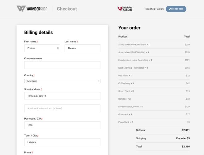
Having a distraction-free checkout is one of the best ways to reduce cart abandonment rate and increase conversions for your store. If you use our One click demo import you will get the distraction free checkout set up out of the box. But in case you would like to create a distraction free checkout from scratch continue reading and follow our short guide on how to do that.
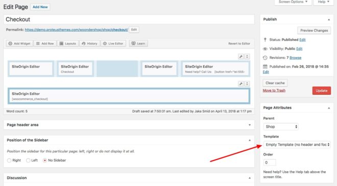
In WoonderShop we added new page template called Empty Template (no header and footer). This is our first step in making a distraction-free checkout page. When we select this template header and footer are no longer visible, giving all the focus on the content. This page template can be also used for many other pages like coming soon page, landing page, sales page and so on.
Let’s focus back on our distraction-free checkout page. When we edit our checkout page and choose the empty template, the style/design of the checkout page will automatically change.
The last thing we did is that we used our page builder to create a header with some trust-building elements. You can make your own header or use our page builder layout. If you want to use our page builder layout from the demo you will need to download it here -> woondershop-distraction-free-checkout.json and import it on your checkout page -> Layouts -> Import/Export.


