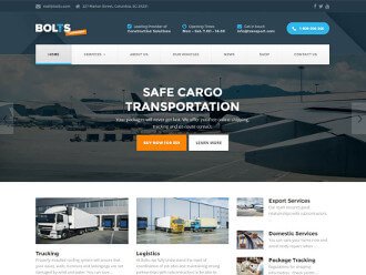
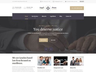
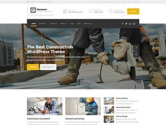
In the last month I’ve been talking to many people who regularly buy WordPress themes. These were wonderful chats and I am already committed that I will integrate that as part of my workday.
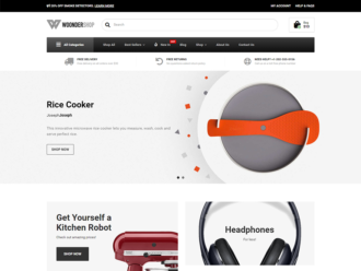
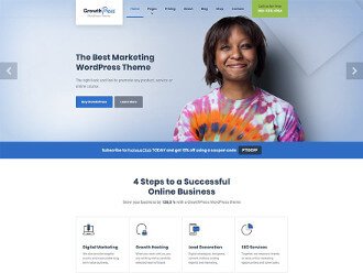
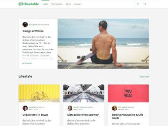
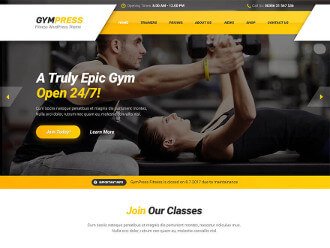
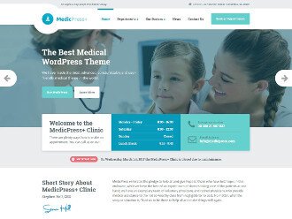
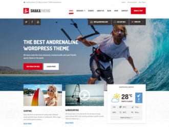
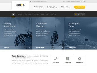
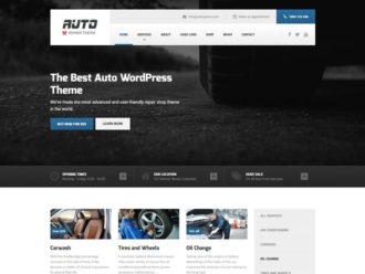
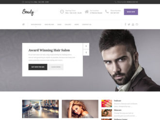
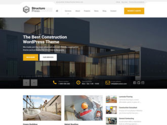
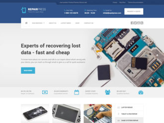
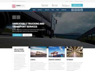
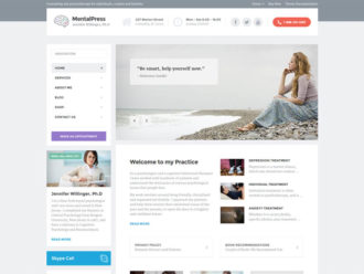
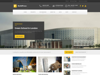
When I asked these people what frustrates them when they go for a hunt for the next WordPress theme I got many different answers. However, the one that always popped out in one way or another was “most WordPress themes look the same”.
And you know what? I agree with them.
Heck, even we started getting feedback from our users that recent ProteusThemes’ themes started to look the same.
It’s an obvious problem we want to tackle with our themes.
When you are buying a theme you are essentially buying a shape for your content. This shape comes as a design, so WordPress themes equal design (in a nutshell at least). Sure, WordPress themes are nowadays much more than just a design, but what you are essentially buying is design with a promise that it can be easily used and customized to your desire. And that it works with multiple plugins. And that it has 6 sliders. And that it has integrated page builder that is intuitive to use. And … you get it.
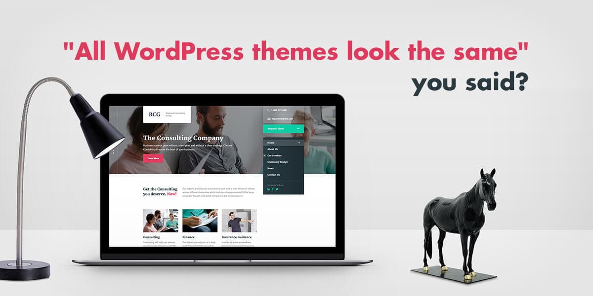
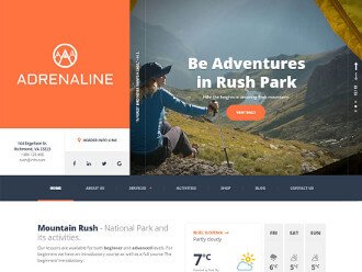
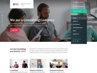
Adrenaline and our newly released ConsultPress are two themes that we’ve deliberately decided to challenge ourselves and deliver something fresh and unique.
I’ll mention just a few key aspects how we made ConsultPress differ from the vast majority of mediocre themes by copycat authors.
ConsultPress was created for a personal consulting or financial business in mind. Personal business trainers, soft skills coaches, business coaches, professional translators are the type of people who’d find ConsultPress theme fit their online presence in a fresh, unique and attractive way that will bring new clients.
A business website has a single top priority purpose: it should bring you new business. It’s a place where potential leads should find you and get the information they are looking for. I’ve spoken and worked with several coaches when creating ConsultPress, so the theme solves real digital problems and brings results to the table through a unique way.
Header and main navigation
No more sitewide header – all themes have it, so there is no need to create another theme following the same pattern. Instead, there is a standalone place for the logo and on the right hand side the widgets area most suitable for the contact information (phone and email).
Right after the widget area, there’s a main navigation – even though it’s placed to more controversial right sidebar, it’s the common place where the visitors will leave their mouse pointer.
The magic happens when you start scrolling down the page – when the top of the menu hits the edge of the viewport, it will stick with you all the way down to the bottom:
We’ve also covered the scenario when the main navigation, together with an optional sidebar, is higher than the screen size. It can be seen in the News (blog):
This way the main navigation and the sidebar is always there.
Another benefit of sticky sidebar menu is that the website will feel more complete and full, even if there is not so much content on the website. I remember from the time when I was working as a freelancer and setting up websites for local small businesses, the hard part was not spinning up a new website and make it work as the client wanted. The hardest part was to get the content from the client. It is undoubtedly the benefit if the site still looks “full” even if you only get handful of paragraphs for the front page from your client.
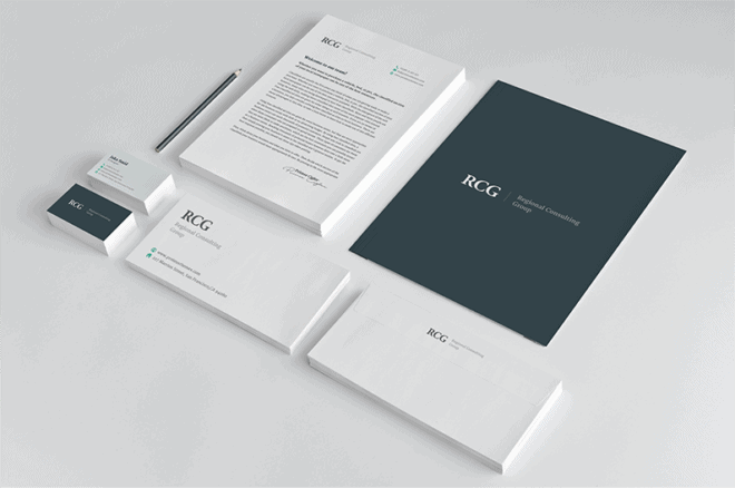
Stationery design for print
The idea for the stationery design actually came from my accountant. When I met with him last month, he complained that it was hard for him to unify the online and offline appearance of his business. He told me that first he had to setup his website and that served as a foundation later on, when he needed business cards, letterheads etc.
For me, that was an ‘Aha!’ moment – what if the WordPress theme could come with stationery design files that match the look & feel of the website itself? This would save someone who’s right at the beginning of his/her business venture lots of trouble and money.
ConsultPress is the first WordPress theme that comes with the Adobe® Illustrator® editable:
- Business card design (front and back),
- Envelope design and
- Letterhead design.
All you’ll need to do, is to open up these files, change the details to your own, probably change the color scheme and send it to a print shop.
It is definitely an idea that was worth trying out and it highly depends on the feedback we’ll receive from theme users if that’s something they find valuable.
Vertical slider
I’ve been writing about the sliders before. They are one of the most standard piece of every premium WordPress theme. Most of themes bundle premium sliders, but I can tell from experience, that they will slow down your site and are hard to setup and maintain.
Instead, in ConsultPress you will find the slider settings in the most convenient location (page editing screen) and in the most intuitive way (only smart and meaningful settings):
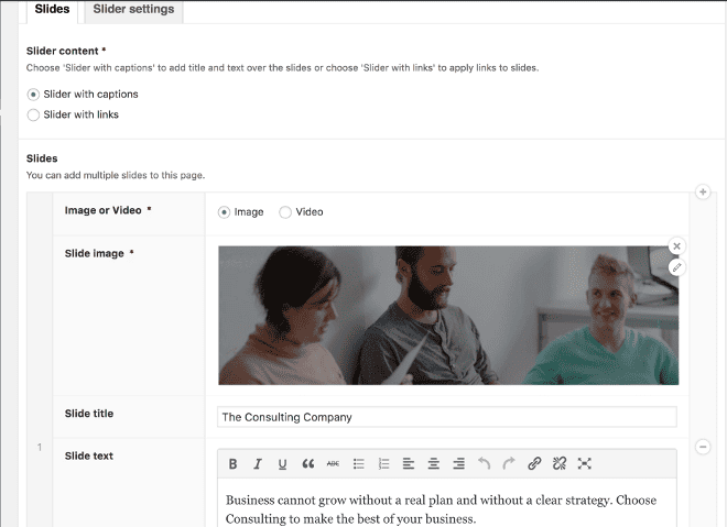
However, if you know your craftsmanship and your choice are popular premium slider plugins, we’ve got you covered as well.
It’s your turn now. Go on and check out the CosultPress demo. You can even download and play with the ConsultPress Lite for free. If you are on any of our theme membership plans, the ConsultPress has already been added to your account and you can get it right away by logging into your ProteusThemes dashboard.
And finally, if you’ve read this entire post, you more than deserve the 10% discount code on any purchase in our shop. Ready? Here you go: IREADPTBLOG.
