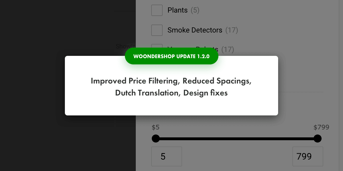
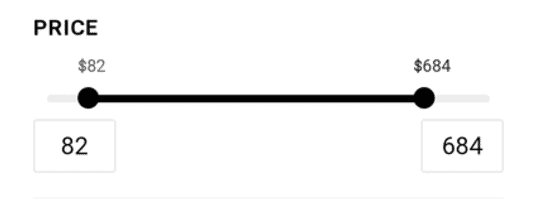
Improved UX for price filtering on mobile
Results of user tests showed the current slider for filtering prices doesn’t seem so user-friendly for everyone, so we added the option of typing in the price, which makes filtering by price on WoonderShop quicker.
Reduced spacing on mobile
Real-estate on mobile is golden, so we’ve reduced all the unnecessary spacings which will make the shopping experience more smooth and friction-free.
New translation: Dutch
It’s the second most commonly used language by customers at ProteusThemes. More translations are coming soon (which language would you like us to translate WoonderShop next?)
Design fixes
In order to build the highest converting WooCommerce theme, we keep fixing any design anomalies we and our users find. Whether there are issues with contrasts, paddings, unified styles, font sizes or border-radius. Everything adds up to a better user experience. Take a look and see if you can still find any design issue.
You can see the entire list of changes in the WoonderShop changelog.
