It’s 2017. Cars drive by themselves, artificial intelligence is a real deal but a lot of websites are still stuck in the past. By that I mean they are not mobile friendly. They are slow. They have a huge lack of SEO standards.
Having an actual user in mind while making new products matters. Let me tell you my traumatic story about how I realized that.
Lunch Time
It was some January afternoon. I came home from work and started cooking my second lunch that day. Yes, I eat lunch twice a day. First lunch at 10:30 at work and the second one at 16:30 at home. The lunch was pretty basic, some chicken breasts and rice with peas. I was eating and looking outside of the window. I didn’t put much attention to anything. Most certainly I didn’t think of what strikes me seconds later. Right after I ate the last piece of the meal I started feeling a stabbing pain in my stomach. Believe it or not, it wasn’t getting any better.
Not-feeling-good Time
I started sweating and immediately I felt exhausted as hell. I laid down on the couch and shrank into the weirdest position you could possibly imagine. The pain didn’t want to go away so I had to do something. I thought I could call the ambulance but then I convinced myself that maybe I’m not in that kind of pain. I mean, I would call an ambulance but only if I would be in a deadly situation. Anyway, I had to get in touch with a doctor or get help somewhere else.
Looking for help
I would visit my personal doctor but since I moved to another city couple of years ago, I didn’t get myself a replacement. I was in Ljubljana and my personal doctor was 60 km away. OK, she won’t be the one who could help me out. I had to find medical help somewhere else.
Bear in mind that I was still lying down on the couch in maybe a little less pain than before. I took my phone and googled doctors/medical clinic near me. The results were terrible. Google said that the first medical clinic was 11 km away from me. Don’t bull***t me, I live in the capital and you are telling me that I have to drive 11 km to get medical help. That couldn’t be right, no way. I’m sure I saw at least two clinics closer than 11km in the last couple of years. Anyway, I tried to change the search terms but Google just didn’t want to cooperate. Ok, maybe part of that was my fault because I was in such a pain. At that time I wouldn’t be able to remember even my mother’s name. Google should know when the user is in a really bad situation and try to give him a little more accurate results than usual 🙂 But at that time I couldn’t find any medical help near me.
When SEO didn’t do the work, luck did
Remember, I was still in pain, sweating on my couch. A couple of minutes later (at the time it felt like it was hours) I finally got lucky and found a directory of all the health centers in Ljubljana. I sorted them out by location and tracked down the clinic in my alley that was walking distance away from me. I searched for the exact name of that clinic and finally came to their website. You would think that I found a telephone number, called them and all my problems went away? Hell, no.
I found a piece of history
As soon as I clicked on the first hit, the harsh reality came up. No mobile version of the website. Perfect 2009 all over again. I had to zoom in, zoom out, swipe left and right with no orientation whatsoever and with annoyingly pointing pain in my stomach.
At that time I didn’t have other options. I had to find medical help if I wanted to start feeling better. I don’t know about you, but sometimes if I feel really bad and nobody is around me, I start panicking quite quickly. I’m thinking that I’m going to die and nobody would be there to help me.
So I was determined that I’m going to find the bloody phone number. The page itself was loading extremely slow, it felt as if centuries have passed. In a couple of minutes, I found a phone number in the footer, by accident I guess. FINALLY!
From there on, everything went smooth. I called the number and they said I can come right away. The soon as I came to the clinic, the doctor checked me out. He said it was a stomach flu. I didn’t get any medication but he gave me some painkillers to reduce the pain in the belly and told me that I have to hydrate for the next couple of days.
“You can’t connect the dots looking forward; you can only connect them looking backwards. So you have to trust that the dots will somehow connect in your future.” Steve Jobs
Anyway, I was getting better and better and in a week I got back to work. My colleagues were just finishing with the development of the ConsultPress, so we started talking about which theme we should develop next. There were a couple of interesting ideas, from blog theme to multi-purpose theme. The final decision was that we want to make a medical theme since demand for medical themes is huge.
We started working on a thorough research, looking for real examples of clinics’ websites and drafting first paper wireframes.
… and then I had an epiphany.
A week ago I had an annoying experience looking for doctors’ help online. The timing just couldn’t be better. I was the perfect example, an ultimate user tester, how and when actual users visit health centers’ websites. From that experience, I knew exactly what is important on health center websites. I knew what had to be exposed and what are the user’s feelings when they are searching for information. The website itself also had to be discoverable in search engines I don’t want anyone else to have the same experience I went through so I told the whole development team that local SEO and discoverability on this project is more important than ever before.
UX matters, sometimes more than you think
Now I had the perfect opportunity to make doctors online presence better and create a medical theme that is actually useful. This was the very first time that I really felt like I’m going to make the world a little better place by being a WordPress theme designer.
I know this is hypothetical but let’s do some maths. At ProteusThemes, we have sold 27.000 WordPress themes and we made 15 themes all together. That means that every WordPress theme gets around 1800 sales on average. If MedicPress will get the same amount of sales, 1,800 clinics will get a better and more useful website. That means that ten thousands of patients every year will get their information, contacts and medical help faster and more accurately than ever before. I’m sure there will be emergency cases among them, where every second could make a difference between life and death. Even if MedicPress helps only one person with the stomach flu, my job as a designer will be done.
UX matters even more.
My focus when designing MedicPress was with patient in mind. What are their needs? How are they searching for the website? What’s the situation when they will visit the website? What kind of information will they search for? How will they navigate the site? How is a patient going to feel at the time?
Mobile Friendly
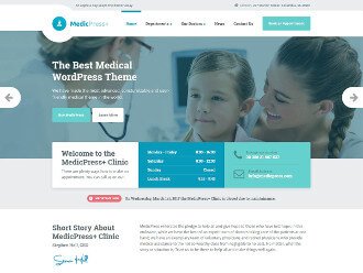
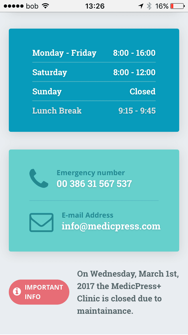
We make MedicPress with a patient in mind. The page is mobile friendly and it shows what matters the most. The contact details and emergency numbers are just a little below the top. No more zooming in and out, that is history.
Local SEO is important
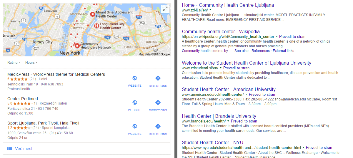
Maybe you are not aware at the moment, but people in trouble really need to find you. Let’s say you have a stomach flu or tooth-ache. You are not going to call an ambulance or at least I wouldn’t. What are you going to do? You would probably google for the nearest medical help. I’m sure you would rather see the left version than the right. The left one gives you every information you need. Address, directions, phone number and even star ratings.
With MedicPress, we wanted to make sure that patients get the right information quickly and hassle-free. Doctors benefit from that either. They get more patients, patients are more satisfied and more willing to recommend the doctor to others.
Picking a new doctor is very delicate
You have to feel good and secure around them. How does picking a new doctor look like today? You go to the website of the nearest health center, click on about us page and pick the one which looks most trustworthy to you.
When I designed MedicPress theme I had that in mind. I put an extra effort so you could present your doctors as good as possible.
“About the doctor” Page Design
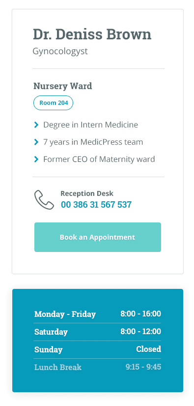
This page has everything about page needs. A big picture of the doctor so you can see how your doctor looks like. A big red notice if the doctor is not available.
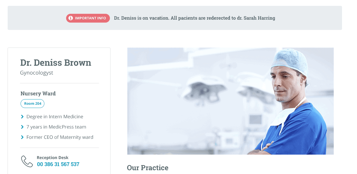
On the left-hand side, you see which are their specialty areas, what are their strengths, how long they have been in the field, which schools they attended, their contact details, booking an appointment, opening hours.
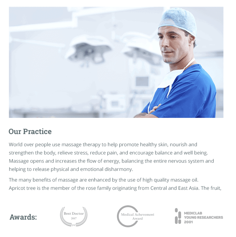
On the left-hand sie, you can see a short description of the doctor and all the awards they won during their career.
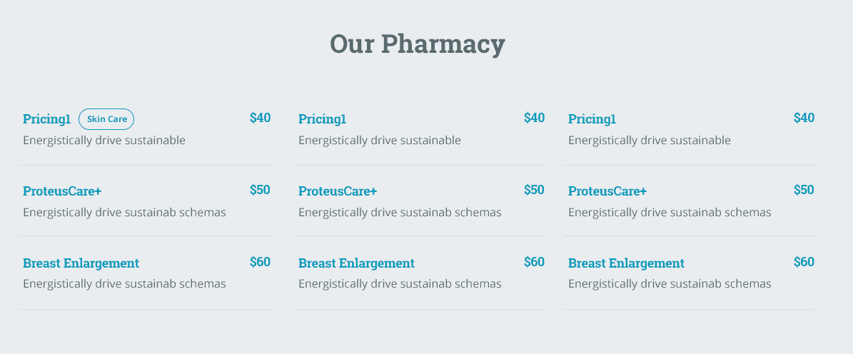
Even though medical help in Slovenia is free of charge, we know there are a lot of countries where this is not the case. With that in mind, we also created a simple yet readable pricing table. This is a very important piece of information, especially for the patients.
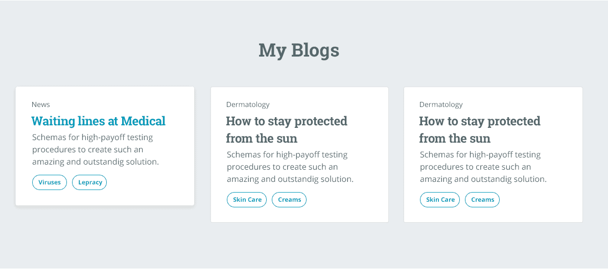
Below that is doctor’s personal blog where they can publish their researches and personal thoughts. What is better than getting tips on how to feel better directly from the doctors’ blog post?
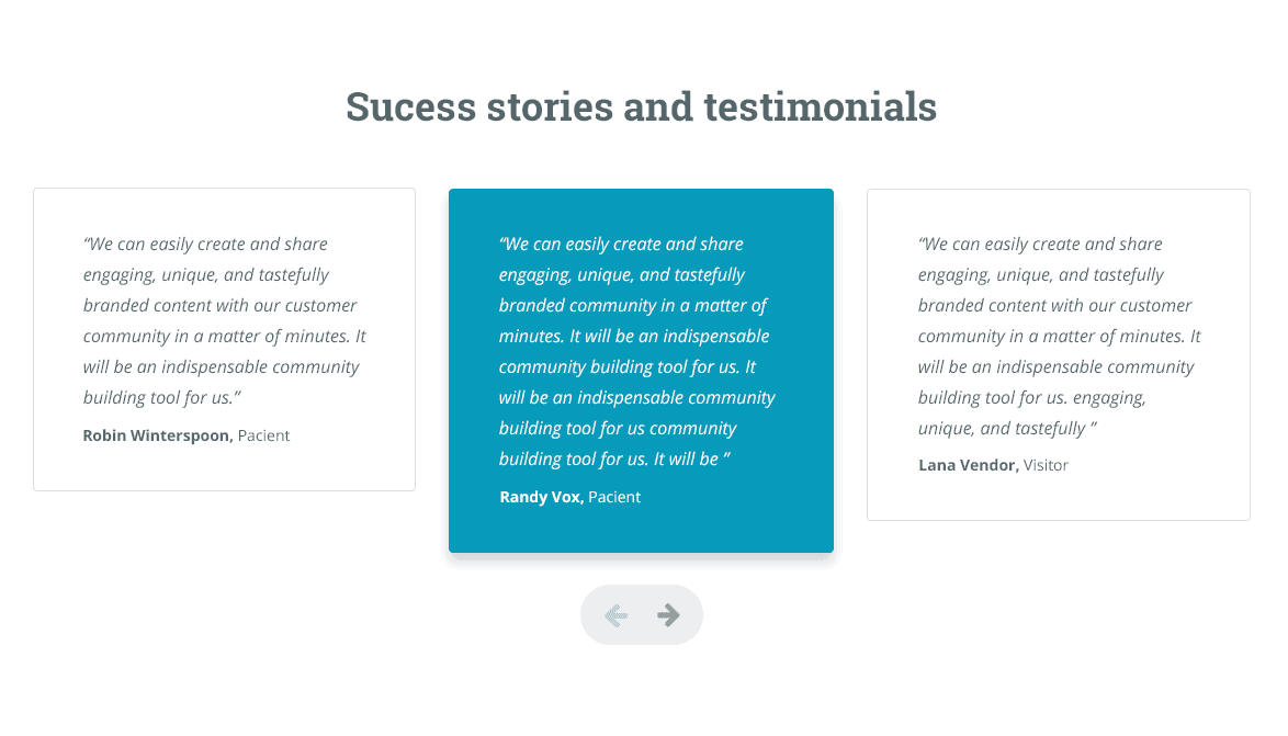
At the bottom of the doctor’s page, there’s a place to show stories and testimonials of satisfied customers.
Final thoughts
Sometimes good user experience means saving someone’s life by a minute. In other cases, the good user experience can save a lot of pain and troubles. Guys, whatever you do, always have an actual user in mind and focus on how you can make their life a little better.
