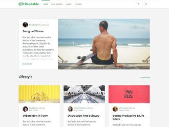
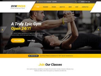
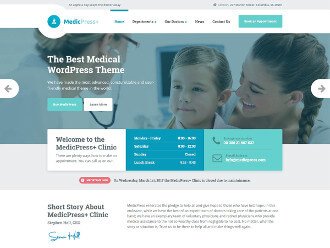
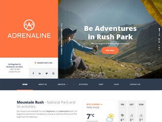
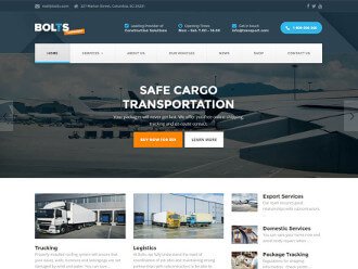
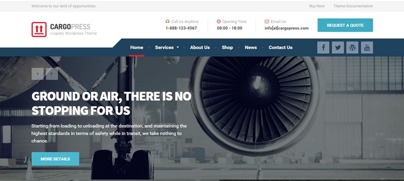
After the release of MentalPress, Primoz and Marko wrote an article about Footer layout settings in WP live customizer. Now, with our newest theme, CargoPress just released, we wanted to present another side of our themes: design.
Jaka Smid is a great UI/UX designer, a co-founder of ProteusThemes and such a nice person to talk to 🙂 Jaka and I talked mostly about ideas and the concept behind the CargoPress design and WordPress themes in general. Do you know why the header is so important in web design and what the vertical lines in CargoPress’s main menu represent? Well … Jaka revealed (almost) everything!
First step: inspiration, ideas and the concept for a design
We all know that getting started is the hardest thing to do. Jaka says that at the beginning he has to push himself for a few days to figure out the (main) style of a new design and when this is done, things flow. “I think that web design is 99 % perspiration and 1 % inspiration. I don’t sit and wait for an idea to come into my mind. Yes, sometimes I already have an idea where a design would take me, but sometimes I must be very pragmatic: I love to search on Shutterstock, where you can get all the photos, vectors and illustrations for a certain keyword and most importantly, it is distraction free. Sometimes I search on Dribbble and Behance also…With time you get a bag of tricks, but testing and research is a must, because you must figure out what works well and what doesn’t.”
He usually starts with a paper and a pencil, trying to figure out all the elements on the website or – maybe you’ll be surprised – he starts with a selection of fonts and typography. “Typography is the most important element in web design and a basic element for good UX. I always try to use a max of two different fonts, not because I don’t know how to combine more of them together, but because when I design a WP theme, I must keep in mind that a non-design user will work with it in the end and in a way it’s my responsibility to limit some design options so that whatever he or she does, it will still work fine as a whole.”
The main inspiration behind CargoPress
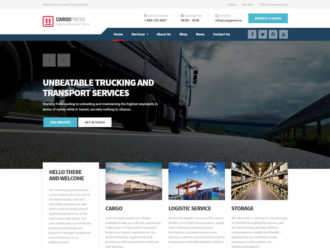
Designing CargoPress actually began at the bottom, with the counter. Jaka explains that the main idea came from stamps, not yet torn apart and still attached together, because “transport, packaging, door-to-door delivery and stamps were constantly going through my mind. They somehow connect all these niches that CargoPress applies to, together.”

What about the main navigation?

It’s hard to miss that it has distinct vertical lines! Believe it or not, the main inspiration actually came from a Slovenian railway website, “because in those vertical lines I saw a road, a railway and bus lines but in an awesome and crazy way”.
The header is “THE” part of the website design
When you are searching through Themeforest, what catches your eye? Remember, we are talking about design: the colors, whether it is a modern or trendy design, and whether it is something that will create a wow effect. Well, Jaka says that if you are a designer, you must capture that wow effect, that feeling and concept of the whole design in the header, “because this part of the website captures the entire screen without scrolling. It actually shows the main idea and feeling of the design and you have just a second, maybe two, to gain the attention and engagement of potential buyers who may scroll down to see more.”
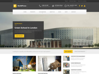
Reusing old ideas and redesigning them in a new way If you pay close attention and compare CargoPress with other themes, developed and designed here at ProteusThemes, you may notice similarities between the testimonials in BuildPress and CargoPress, or the opening times and contact widgets, which are very popular with our clients.

“My worst fear is always the fear of repeating myself, because some of the elements we used in previous themes were very useful, so I have a bit of a guilty conscience when I reuse them … but if they work well, why not? The bottom line is that the main purpose when designing a WordPress theme is not being awesomely creative, but to make useful themes for final customers. Those examples are not a direct copy and paste, but redesigned and reimplemented in a somehow fresh, but proven way.”

At the end, Jaka emphasizes that designing a WP theme is a very specific job: “Not only that all the content must be modular, but the design must represent the selected niche and it must stand out from other competitors and we all know that competition in this field is HUGE, so it’s crucial to check what others are doing, especially in a niche that is somehow related to the one we are developing and designing at the moment.”
