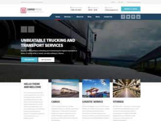
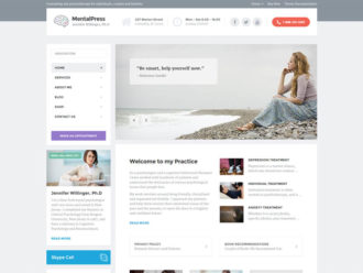
For the past 7 years, sliders (or carousels if you want) are something almost every website has. It’s a common practice. Something that we are all used to. It’s the first thing your visitor is going to see on your website. It’s make-it-or-break-it moment. The slider images have to make an excellent first impression, or you are going to lose your visitor forever.
When I’m looking through the websites our customers made with our WordPress themes, I often see poorly prepared slider images. Most of the time photos are too big or too small. The text on the slider is not visible enough, and the images are not optimized, so the page itself loads extremely slowly.
My heart breaks a little bit when I see an overall good website with a good copy, but crappy slider images. I decided to stop this madness by sharing some simple tricks.
1. Choose the right photo
First and foremost. Choose the right photo. Choose an image that is descriptive enough and has enough of white space. Take a look where the text on the slider appears and choose the image that has as little visual noise as possible in that area.

2. A high-resolution photo is a must
Use the resolution that is recommended by the theme maker. In the past 4 years, I’ve seen a gazillion websites with small resolution photos stretched all over the screen. You cannot miss if you choose an image that is 1920px wide. Nothing discourages your visitor more than a pixelated photo in the slider. Excellent resource of free, high-quality photos is Unsplash. If you have a budget, I recommend you buying premium photos on Shutterstock. The investment will pay off.
3. Darken or lighten the photo
A good trick how to make a text on your slider more visible is by darkening (or lightening) the photo. This could be done in Photoshop or any other photo editing program. For this tutorial, I will use free design app called Canva. After you sign up to Canva, click “Create a design” in top left corner. Then in the top right corner click “Use custom dimensions” and input the dimensions recommended by your theme developer. If there is no recommended resolution, go to the demo site of the WordPress theme and inspect the photo (or change your WordPress theme provider with us 😛 ).
Click “Design!” and go to the “Uploads” in the left menu. Upload your slider image and drag & drop it on the board. In the top menu, click on “Filter” and reduce the “Brightness” and “Contrast” for 10-20%. If the color of the text on your slider is white, you want to make your photo a little darker to improve contrast. If you have black text on your slider, you want to do the opposite.
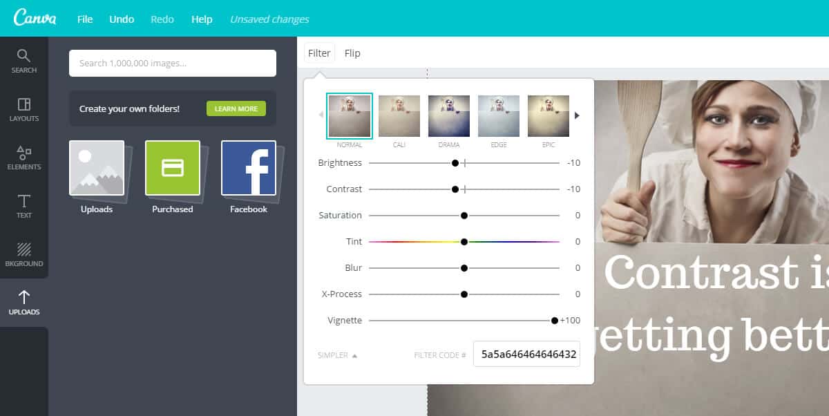
Make a step further. Colorize your photo in your brand colors by moving “Tint” (Hue) carousel a little to the left or right.
4. Semi-transparent color overlay
Sometimes you just cannot find a photo with enough white space for the text or your client want you to use an over-saturated image where your text wouldn’t be visible enough. In that situation, the most straightforward thing you can do is to make a semi-transparent color overlay.
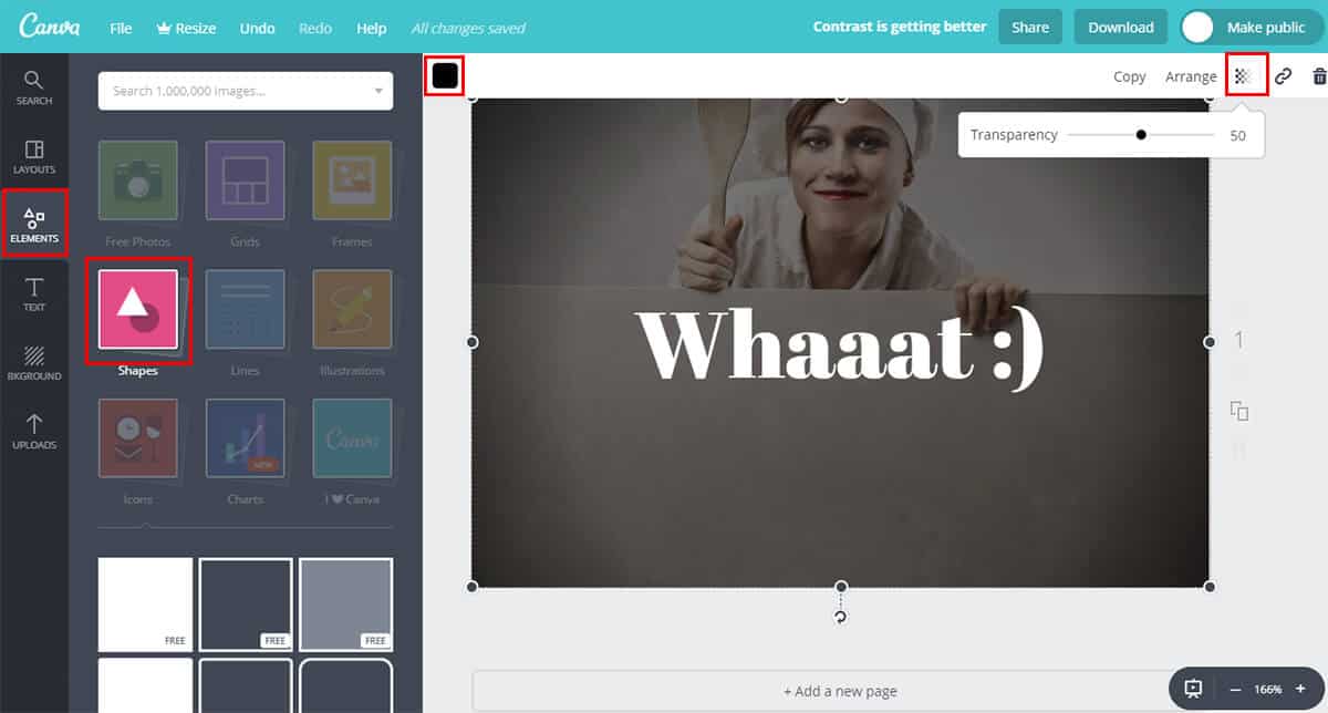
To do that, go to your Canva app > Elements > Shapes and drag & drop the first white or second dark rectangle to your board (where it says free). Resize that rectangle from edge to edge and color it to the black in the top left corner. Then in the top right corner set transparency for your rectangle to ~50%, depends on how much contrast you need.
5. Add inner glow to your photo
Another great trick to make your slider photo more interesting is by adding black semi-transparent inner glow. This method will make your site look even more professional. It will put the focus on the center of the screen. In Canva app, this effect is called “Vignette” and you can find it in top menu “Filter” > “Advanced Options.” When you are satisfied with your slider photo, you can save it by clicking “Download” button in the top right corner.
6. Choose the right file type
When you are saving your edited slider image, it is important (due to the file size) to choose the right file type. Don’t worry; the rule is simple. If your slider image is an actual photo, save it as .jpg. If it’s anything else than a photo (i.e., pattern, icon, doodle), save it as .png. This is important because you want to have your slider images as light and optimized as possible.
7. Page speed matters a lot
For both Google and your visitor. Slider images are the biggest images (maybe even files) of your website, so it is important to have them optimized. Great tool for decreasing an image size is TinyPNG. Their simple drag & drop interface allows you to decrease the size of the image without losing quality. See the ultimate guides for image optimization and page speed optimization.
Bonus tip: Use the recommended size of slider image
When we are developing WordPress themes, we put extra effort in choosing the right size and ratio of the slider photo. The photo itself has to work well on every screen size. I see a lot of cases where users use different sizes from recommended. Most of the time, the photos in slider take too much vertical space.
This is s not a problem for the functionality of the slider itself, but if your visitor has to scroll a lot to get to the content, it does nothing good regarding user experience.
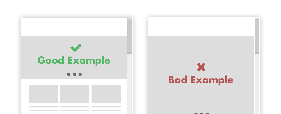
If you still want to use bigger images than recommended, please at least have in mind a good old above the fold rule.
The slider is the first thing your visitor is going to see on your website. Make their user experience better by implementing some of the tricks above. It will not take you much time, but it will improve the happiness of you, your client and your client’s visitor.
So now that you have an idea on how to improve your slider images, let’s discuss the pros and cons of using sliders. As it turns out, there is plenty of research that says sliders can hurt your website more than they can help it. Even the authors of Yoast SEO plugin say sliders should be banned from your site so it’s definitely worth discussing advantages and disadvantages of sliders as well as when they are appropriate and when it’s best to avoid them.
Cons of Using Sliders on Your Website
First, let’s take a look at the most important disadvantages of sliders.
Very few slider plugins are truly mobile responsive
Have you ever come across a website that uses a slider and tried to view it on your phone? While it’s true that phones are getting bigger, the simple fact is that most sliders resize to accommodate the smaller screen size.
This results in both images and text being too small to be read and viewed on smaller screens. In the end, your beautiful slider will more than likely be ignored on phones so think twice about the content you’re adding to your slideshow.
If you’re lucky enough to use a responsive slider plugin like Soliloquy, be prepared to spend some time customizing your sliders to ensure they look good on all devices. While you’re at it, make sure to test the slider and see how it looks on a variety of screen sizes and devices.
Most visitors won’t stick around past the first two slides
If you take into consideration that our attention span is getting shorter and shorter, it’s safe to assume most visitors won’t stick around past the first couple of slides.
When visitors land on your site, they want to instantly know what you do and how you can help them. If your slides don’t answer those questions, chances are they will move on.
Slider controls can be easily missed
Slider controls are usually unobtrusive icons designed and styled so as not to detract from the actual slide content. As such, those arrows used to navigate through the slider can easily be missed.
This problem is even more evident on smaller screens which means your mobile visitors will have a hard time going back and forth between the slides or clicking the button that takes them to another part of your website.
Sliders can slow down your site
If you’re not careful with optimizing your images for the sliders and web in general, sliders can slow down your site. What’s more, sliders often use resource-heavy JavaScript files.
Each of those JavaScript files is another request that a browser has to make to the hosting server that your website is on. While the browser is making those requests, your visitors are waiting for your website to load as the browser cannot proceed until the necessary JavaScript files (as well as style files for the sliders and your site) have been loaded.
As a result, visitors might become frustrated and leave for another website that loads much faster and provides them with the same solution that they came to your site for.
It’s also worth mentioning that because of the impact on website loading times, sliders could negatively affect your SEO.
Human eye reacts to movement
Finally, keep in mind that our eyes are naturally drawn to the movement. If you use sliders throughout your website, they can distract users and cause them to stop paying attention to the rest of the content on your site.
Each time a slide changes, you run the risk of your visitor who was about to click that booking button to focus on something else. This could lead to a loss in conversions which then leads to less sales and less profit overall.
Another thing to keep in mind is that if you are using a slider, don’t use the auto-slide option as it can quickly make the user experience for your visitors worse. Imagine if someone begins reading the text on the slide and then the image changes before they are done reading it. This could leave your users frustrated and cause them to leave your site.
Pros of Using Sliders on Your Website
Now that we’ve covered the cons of using sliders, let’s take a look at why you might want to consider using one.
You can showcase more content in less space
Due to their nature, sliders make it easy to show more content above the fold or anywhere else on your site without creating long pages. You can use as many slides as you like to share the message you want through the slides and present it in a visually appealing way.
This allows you to keep your homepage short and sweet, focusing on the most important elements instead of using all of that space to tell a visual story about a single product or a service.
Sliders make it easy to add text to images without using Photoshop
Most slider plugins allow you to upload your image and add text to it without using Photoshop or other image editing program. Some sliders even make it possible to add buttons and calls to action or links to other parts of your website.
Thanks to the slider’s admin interface, you can easily write and format your text using tools similar to those found in the post editor or Word. You can even customize the slide design by adding custom colors or fonts, adjusting the type of transition and the duration, and more.
Sliders force users to interact with your website
As crude as it might sound, sliders make it impossible for users not to interact with your website. If they don’t want to wait for the next slide to appear, they can simply click the arrows to go back and forth through all your slides.
If you’ve included links or buttons that take them to a different page, they can click the buttons and explore everything else you have to offer on your website. In other words, slides provide more engagement for your users so if you want visitors interacting with your site from the first time they land on it, sliders could be the answer.
Sliders are a great way to share your work
If you’re a designer, an illustrator, a photographer or an artist, sliders are a great way to showcase your work without having your portfolio occupy the entire page. You can put together a slideshow of your best work and share it as a slide on your homepage or even your portfolio page.
Sliders also come in handy if you sell products as they can be used to showcase most popular products, new arrivals or specific categories.
The Verdict: Should You Use Sliders?
With pros and cons out of the way, it’s time to make a decision: should you use sliders on your website? The answer to that question can be summed up in two words: it depends.
When Is Using a Slider a Good Choice?
Pros and cons aside, there are still a few good scenarios when using a slider is a good idea and a solid choice.
- Use a slider when you want to showcase your work or a gallery. As mentioned earlier, sliders lend themselves well to displaying photo galleries or portfolio items. If your website belongs into that category, then by all means, using a slider is a great way to showcase your work without overwhelming your visitors.
- Use a slider to showcase a product. On a similar note, if you are launching a new product or a service; a slider could be a great way to demonstrate the product in action or to highlight its benefits and features.
- Use a slider to share a cohesive story. This could be the story of your brand and your company or you could highlight your team members and their expertise. No matter what kind of story you decide to share in your slider, be sure the story makes sense, otherwise, your visitors will be looking at a bunch of unrelated slides that don’t make sense. At the same time, make sure each slide builds anticipation for the next slide and intrigues your visitors so they stick around until the last one.
When You Shouldn’t Use Sliders?
It goes without saying that if your website doesn’t belong into one of the above categories or if you aren’t using sliders to add to your website, you should steer clear of the sliders. Here are a few more scenarios when using sliders is not a good idea.
- If you’re only using a slide because it’s hip. Just because everyone else is doing it, that doesn’t mean you have to do it too. Not only do you run the risk of not adding anything valuable to your site with a slider but you also run the risk of blending in and looking the same as your competition.
- If your website is already slow, refrain from using sliders. As we’ve said above, sliders can be quite resource-heavy so the last thing you need to do is make your site even slower to load. Work on fixing your site speed first, then consider adding a slider.
- If you don’t know what to put in your slider, don’t add one. A slider works best when there is a story behind it. Without a story, you have a mess of images that don’t add any value to your site and may even confuse your visitors.
- If you can share the content in a simpler way, do so. There is no point in overcomplicating the design of your site or sacrificing speed for the sake of the latest design trends. A simpler solution usually means your site will be easier to update and maintain, not to mention faster to load. As such, foregoing a slider in favor of a simpler solution is a much better choice.
Conclusion
Now that you know the pros and cons of using sliders, you can make an informed decision whether using a slider is a good choice for your website. And with the tips about optimizing slider images, you will be well on your way to creating attractive slides that won’t hurt the user experience but will help you get more conversions instead.
