When it comes to your online store, user-friendly design matters. A useful and well-organized website is more likely to get potential customers to stick around and browse your products to see what you have to offer.
Another important feature your e-commerce store needs is fast loading times. If your website takes more than 2 seconds to load, chances are your visitors will abandon it and go to your competitor.
While speed and design matter, they are only the beginning. In fact, there are 10 key functionalities that every e-commerce store needs if you want to see more sales, more conversion, and more revenue at the end of the day.
In this post, we’ll cover what those functionalities are and why they matter.
1. Auto-Complete Search
If you’ve been running your online store for a while, you probably know how important it is to have a search bar highly visible, on top of the page on your website. According to statistics, 8 in 10 shoppers report using the search box while they shop online either often (45%) or always (35%). This allows customers to search for their products instead of browsing through dozens of pages in your store.
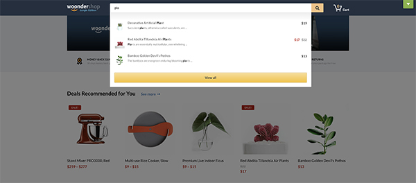
Take the search to the next level by implementing the auto-complete search. Auto-complete search automatically suggests products as your visitors are typing in their search term and allows them to instantly click on the suggested product. It also prevents misspelled words, so customers won’t lose time searching for products that don’t exist.
In short, auto-complete search allows visitors to interact with the search functionality on your site faster and get more relevant results, which in turn leads to better conversion rates.
2. Real-time Filtering and Sorting Options
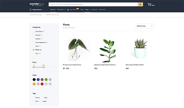
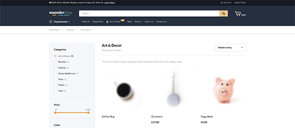
Directly in line with the previous feature are the real-time filtering and sorting options which further help your visitors to find the products they want much faster than simply browsing through each individual category or the entire store’s catalog. The more products you have, the more important it is to have these filters.
A well-designed e-commerce store that’s optimized for conversions will have a variety of filtering options, depending on the type of items that you sell in your store.
For example, an online clothing store should allow visitors to filter products not only by color but also size, price, brand, and even material the products are made of.
A tech store could include filters for price, brand, storage or memory capacity, operating systems, energy efficiency, and more.
Your filters should also include categories and the ability to sort products by relevance, price, popularity, rating, and more.
3. Mini-Cart Animations
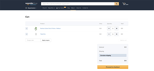
If you’ve ever made a purchase online, you’ve probably noticed how the website immediately redirects you to the cart after you add an item to it. While this can help reduce your cart abandonment rate, it also leads to potential revenue loss and frustration.
Instead of buying more products, they can complete the purchase right then and there. They can also get frustrated if they weren’t done with the purchase because now they have to go all the way back to the front page of the shop and continue adding more items to the cart. However, if you’re selling online a single product, immediate redirect to the shopping cart is better for conversion rates so keep that in mind if you have a one-product shop.
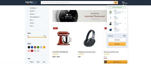
A better way is to use a mini-cart animation that shows them the item has been added to the cart but then disappears and lets them continue shopping without having to go back and start the search all over again.
4. Conversion Optimized Checkout
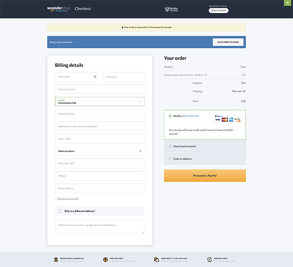
Your checkout page is probably one of the most important pages on your site. That’s why you should make sure that your checkout is distraction-free so you can get the best possible conversion rates and less cart abandonment.
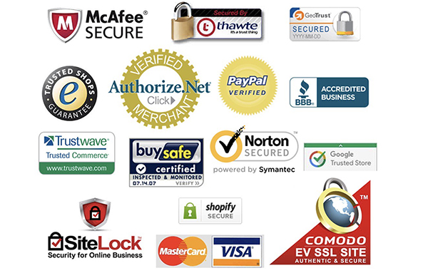
A great way to optimize the checkout is to make sure it’s distraction-free. This means the checkout page should only include a form where visitors can enter their billing and shipping information and complete the purchase and omit navigation menus, social media icons, or any other links that could lead visitors away from your site. You should display return policies, guarantee badges, and shipping costs or phone number in case potential customers will have questions regarding their purchase. You can also consider including trust icons and logos such as TrustE Verified or PayPal Verified to signal a safe and secure checkout process.
Avoid having menus and any outgoing links whatsoever to other pages on your site or linking to your social media profiles as this gives your visitors plenty of chances to abandon their cart instead of finishing the checkout process.
5. Cross-selling Widget
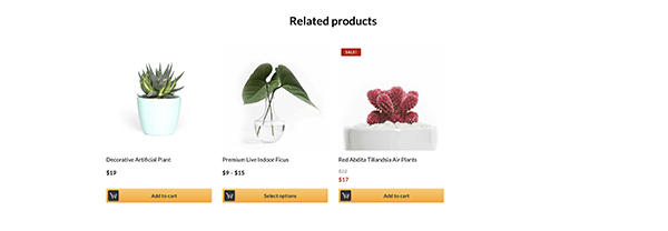
If you’re not using cross-sells and upsells in your store, you could be missing out on a lot of revenue. Adding a cross-selling widget that shows related or similar products on an individual product page is a great way to pique your customer’s interest and get them to click over and check out other products.
The cross-selling widget can help you raise your average order value which results in more products being sold and more revenue down the line. For example, if you are buying a fishing rod, there is a high probability you’ll need to buy some bait or tackle as well.
6. Email Opt-ins
By now, you’ve probably heard the expression the money is in the list. Your email list is the best way to stay in touch with your customers as well as potential customers who just discovered your store but aren’t quite ready to make a purchase.
To achieve this, your shop should include an email optin so you can capture email addresses and safely store your contact’s information in a database. This data can be used to send email marketing campaigns – like special offers, or new product lines.
Free all-in-one tools like HubSpot help you do this. You can capture email addresses through forms or live chat, store contact data in a powerful CRM, and then send personalized emails to share relevant products and offers that help convert your contacts into customers.
Email optins can be placed on your homepage but you can also consider adding them to individual product pages or in the header of your website so they are visible no matter what page your visitors are on. Consider offering a one-time discount or a coupon code they can use on their first-time purchase as an incentive to encourage them to join your email list.
7. Sticky Headers
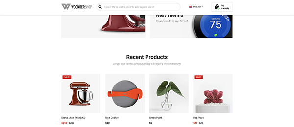
Once potential customers come to your e-commerce store, the first thing they will see is the header area. Your header area is where your search bar and navigation should be as well as the cart icon.
Consider implementing sticky headers to make this area always accessible to potential customers. A sticky header stays visible on the page even if the visitor scrolls all the way down to the bottom. It allows them to search for the item no matter how far down the page they have scrolled and to easily access their cart to finish the purchase. Sticky headers are especially useful if you have long catalogs or using infinite scroll.
8. Urgency Countdowns
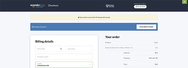
Using urgency to increase sales is a well-known marketing method that can lead to a dramatic increase in conversions. When you present your shoppers with a sense of urgency, they are more likely to make the purchase because they don’t want to miss out on a great deal.
There are several ways to implement urgency in your store; from showing low stock notifications and highlighting products that are on sale to using countdown timers that tell them the item is available during a limited timeframe.
Countdown timers are especially effective on checkout pages as they give visitors a limited time to complete the purchase, making them more likely to do so rather than going through the whole buying process again.
9. Category Pages Optimized for SEO
Getting traffic to your online store is important and while social media marketing and even paid advertising is a great way to make potential shoppers aware of your store, there is no denying the fact that those methods are expensive and time-consuming.
As such, improving your SEO rank and getting organic traffic is a great way to get visitors to your store without spending hours on various social media platforms or paying for ads. Organic traffic means you can save both time and money and focus on creating more products.
An easy way to improve your store’s SEO is to add descriptions to your product categories. You can use the category descriptions to describe the products that are in the category and use related keywords. This helps search engines to better understand what your site is about and to show your site as the relevant result when visitors search for those products online.
Related: 14 ideas on how to drive more e-commerce store traffic without buying ads
10. Flawless Mobile-Friendly Checkout
According to eMarketer, more and more people are using their mobile devices to make a purchase and experts predict mobile sales will only go up. The increase in mobile e-commerce sales is one of the most important reasons to ensure your online store is optimized for mobile devices.
The most obvious way to ensure your store is mobile-friendly is to use a responsive e-commerce theme. However, that’s not the only thing you should do. Your checkout process needs to be optimized for smaller screens which means form fields and the buttons need to be big enough for visitors to comfortably type on smaller screens. They should trigger the correct type of keyboard and allow visitors to easily adjust the product quantity in their cart. In addition to that, you should only use fields that are absolutely necessary and use floating labels since it’s well-known they convert the best.
How to Implement Those Features on Your E-Commerce Store
Now that we’ve covered the key functionalities every e-commerce store needs in 2019, let’s talk about how you can implement them on your site. If your online store doesn’t have any of these features or lacks some of them, there are two ways to go about implementing them.
One way is to hire a developer to add this functionality to your e-commerce store. However, this is also an expensive option not to mention it can take weeks before you find a developer you are comfortable working with and matches your criteria.
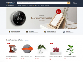
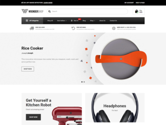
The second option is to use an e-commerce theme like WoonderShop that already has these features built-in. What’s more, a theme like WoonderShop is a lot more affordable, not to mention easy to use so you can add all the above functionality to your store in a matter of hours.
Final Thoughts
You only have a few moments before visitors decide whether your store is the right place for them and continue shopping or decide that they will go to your competitors. Use the tips in this article to make sure you have the right features in place and don’t forget to check out the Woondershop theme if you want an easy way to implement them on your site.
