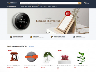
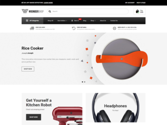
Here are the newest updates for the WoonderShop WooCommerce Theme v1.4.0:
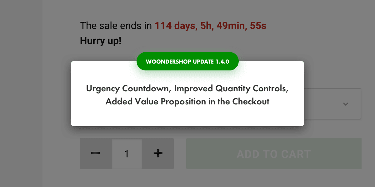
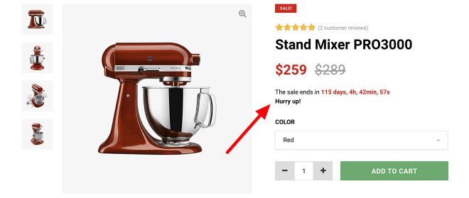
1. Urgency Countdown Timer
This is a growth tactic used by many successful stores in order create a sense of urgency and push the visitors to make their decisions faster.
Whether you have a limited amount of products or there’s a special discount happening, this is the perfect way to increase your conversions and motivate your visitors to buy.
You can enable it anywhere: in the header, on the category banners, within the content, on single product pages, above the category… you name it!
2. Improved User Experience for Selecting Number of Products
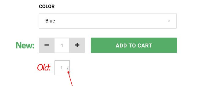
The selection buttons in the default WooCommerce theme are very hard to use because they are tiny and every operating system shows them differently. This is an even bigger problem on mobiles because the buttons aren’t visible and you have to manually delete and input a new number. Yeah, horrible!
But worry not! Jaka, our lead UX designer came up with a better solution.
With the new buttons, it’s 100 times easier to choose the number of products. That means more happy visitors and more conversions for your store.
They’ve been placed on the left from the button ‘add to cart’ which is a standard in the eCommerce world. To increase or decrease the number you can either click on the + or – symbol or click on the number which will open a numbers-only dashboard (instead of the entire keyboard!) which makes it even faster to choose the number of products.
3. Added a Value Proposition Bar in the Checkout
This is one of the best techniques to increase conversions in your checkout (the most important page in your store!).
People have all kind of doubts, objections, and concerns before actually buying. To address all of them, you can use the value proposition bar in the to highlight the biggest benefits of doing business with you. One of the most common cases is a money-back-guarantee, social proof, free returns, secure checkout, free shipping above a specific amount, …
And it’s completely customizable! You can edit it with the Page Builder to insert the benefits that are best for your business and match the design with your branding.
To learn more about the benefits of having a value proposition bar in the checkout, read our article: Microcopy – Small Text that Will Increase Your eCommerce Conversions.
4. Design fixes
Jaka (the lead designer) is a perfectionist that loves user-friendly and beautiful design. He is constantly on the lookout for anything that seems off, and immediately starts fixing it until it looks pixel-perfect. Here’s what he found and made prettier recently:
- All ‘add to cart’ buttons are on the same height as the ‘shop’ category
- Styled and unified drop-down menus on single product pages and checkout
- Reduced spacing on mobile to make content more connected
You can see the entire list of changes in the WoonderShop changelog.
What’s coming next?
Our list of new features is quite long, so we constantly prioritize features and fixes that have the biggest impact on your store.
In the next week, we’ll introduce:
- Desktop sticky menu
- Microcopy updates (see how microcopy or “small text” will increase your store conversions)
- Mobile design fixes
Put Your Idea on our To-Do List!
We regularly implement feedback from our users. If you have any idea write to us via live chat or use the contact us form.
